Instagram

Friday, February 26, 2016

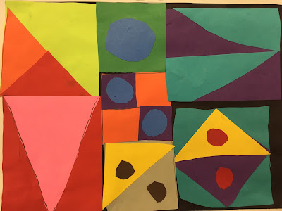
2nd Grade Secret Code Collage

Do you guys know Hope Hunter Knight from Mrs. Knight's Smartest Artists? Other than commenting on blogs and on Instagram, I don't know her a bit. I feel like our philosophies about art ed are very similar. We've shared several lesson ideas and this one is totally ripped off inspired by her original post

This is the second year I've done this lesson with my 2nd graders and I decided it was going to be one of our art show projects this year. The whole project is inspired by a French artist by the name of Auguste Herbin. I know a lot of artists, but he was not one of them when I came across Hope's post. I immediately knew the project would be a winner, though. Essentially, Herbin created his own "secret code" alphabet called Alphabet Plastique. 

I have my students each come up with a title consisting of one or two words. They devise a simple geometric code for each letter in their title. The codes will eventually be made out of construction paper, so they can't be too crazy complex. 

When my students did this last year, I tried to have them plan out the final version of their work in a way that didn't leave any blank space. It got a little too intense. This year, I simply gave students various rectangles of card stock and let them figure out how to best fill their paper. If there was negative space left, it wasn't a big deal. I wound up with better results and fewer headaches. Most kids filled up their page anyway. 

I'm blown away by the work my students create. I have to stop and remind myself that they were made by kids who are only 7 or 8. 

I usually post my lesson plans, but I'm not going to post here because the lesson really isn't mine to post. You can see more details over at Mrs. Knight's blog. 


Seriously. The complexity of shape and the overall design are stunning. 


Thursday, February 18, 2016

5th Grade Plush Creations

Who knew that kids would absolutely love sewing? Oh, that's right. I've taught this lesson several times. I knew that. That's why I keep teaching it. I love it when a tough 5th grade boy comes up to ask if his stitching is neat enough. That will never get old. 
I ran this lesson pretty similar to how I've done it in the past, but allowed a little more freedom this year. Originally, students made monsters. This year I told them they could make anything. The results, as usual, were really nice. 

I love how much attitude the banana has. (Bananatude?)
There isn't a whole lot of technical expertise that is required for this project. That's great for me because my crowning achievement in sewing was making a pair of boxer shorts in 8th grade home economics class. It's simple enough that every student is more than capable of making something cool, but students who have experience with sewing can really run with it and make some cool stuff. 

This guy is named Mr. Pillow. It was originally
going to be an iPad, but I like how my student
reworked his idea to make it more successful. 
My biggest suggestion with the project is making sure that students work with large enough pieces of fabric. I purchased 9x12 sheets of felt. Each student gets two, so the final piece winds up being fairly large. I originally had students use only one piece of felt, so the work was smaller and a little more difficult to work with. I keep all of the fabric scraps throughout the project and students use those for details to glue on with fabric glue once their work has been sewn and stuffed. 

This project is definitely in line with my idea of challenging 5th graders with materials as opposed to overly technical and skill based lessons. I really think it keeps a bigger percentage of students engaged and truly enjoying what they are doing in the art room. 


A Harry Potter book with stuffed covers and actual felt pages!


Tuesday, February 9, 2016

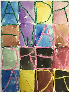
1st Grade Jasper Johns Names


The art show. Hours and hours and hours of preparation for show that lasts a few hours. Is it worth it? Of course it is. Do I look for ways to make it simpler and more streamlined? Oh, yeah. 


Enter Artomé. I had been contacted by art show companies in the past, but I was always a little suspicious. I would furrow my brow and think to myself, "I don't have the budget to pay a company to do what I can do for free." I got some information from Artomé and I realized that I could streamline the entire art show by using them. After talking to some colleagues who used Artomé last year and they were please with the results. I decided to give them a shot. 

Overall, I believe using Artomé will be a good move. They frame every piece of student work - 750 for me this year. It's free. In fact, I'll make some money from the show. I had two concerns. All of the frames are the same size. That means that all of the 2D artwork at my show will be 9x12. Ideally, parents will buy the framed work and I'll earn some money for the art room, so the artwork should be something that will appeal to parents. Hmmmm.... Well, that's a bit of a challenge. Most of my lessons are larger. It has been a challenge to come up with lessons that allow for a fair amount of student choice, but still conform to the required size. I also teach lessons that don't necessarily produce "pretty art." We explore science, history, and math. I design lessons to help students learn about art and the world, not specifically so they can have something pretty to take home. 

This is a new lesson that I decided to use for an art show project this year. It's based on the work of Jasper Johns. I really liked how it allows for some messiness, but the work still comes out super cool. I would include the lesson plan, but I borrowed it from For the Love of Art
and I don't want to take credit for it. It's super simple. Take a page and have students carefully fold it in half four times. When they unfold it, they will have 16 rectangles. Students write their names in oil pastels as large as they can in each box. I found that using only capital letters worked best. Students then took a couple of classes to paint the areas around the letters, trying to loosely conform to the shape of the original rectangular fold marks. It worked perfectly for my needs and it is something that I'll definitely consider using again.