Instagram

Tuesday, November 24, 2015

Ancient Maps by 3rd Grade

I wrote this lesson a couple years ago and I really like it. I know some people who go full choice in their art rooms. Part of me really likes the idea of a choice-based art room, but a larger part thinks that kids really benefit from some guidelines in a project. Just personal preference. I've been working on ways of incorporating more choice within the framework of my projects. I think this lesson gives students a lot of freedom to display their creativity.

Essentially, we look at all kinds of older maps and talk about how they are different than current maps. Hint- they are WAY cooler. They are as much art as they are cartography. Oh, that's another cool part of this project. I get to say "cartography" and "cartographer" all the time. It makes me happy. 

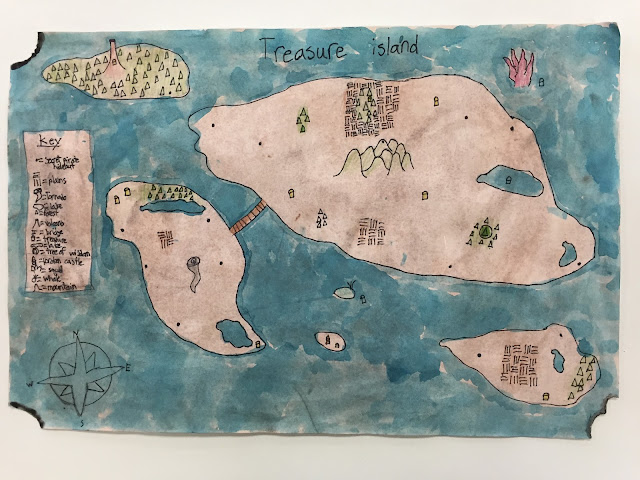
Students then get to design their own map of a fictional place. I let students have pretty much complete freedom in the theme of their maps. Some choose to create maps of video game worlds, some map out locations from a favorite book or tv show, and others just completely freestyle. I ask that they include both water and land, a title, a compass rose, and a map key. Additionally, I ask them to include at least six landforms. Parts of maps are part of the 3rd grade social studies curriculum in Ohio and landforms are in the curriculum for 4th grade. 

I really like the results I get out of the project. It's fun to sit and study the small details that students put into their work. I have learned a couple of things over the years to make the project run a little smoother. Liquid watercolor works very well for painting the water. It's easy to prep and I'm not constantly replacing the blue in my watercolor trays. It's also a lot more consistent in terms of color. I also have students add color to map details with colored pencils. It's just a lot neater than the results I got the first year with watercolor. 

Click here to download my lesson plan!


Click here to download the handout I put together to help students with this project!
Beautiful details from the map above!


Detail of "burned" map edges. Wet on wet watercolor tricks!


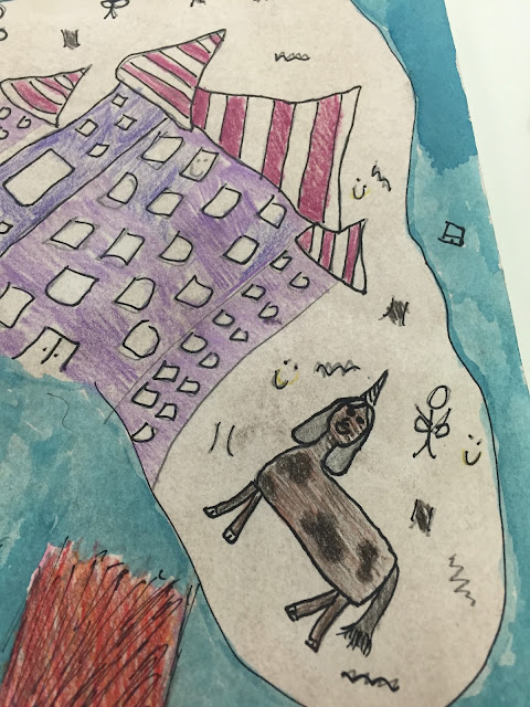
Were you wondering what a fairy unicorn princess looks like? Wonder no more!

Great example of a map with mostly land. 

Tuesday, November 17, 2015

Hundertwasser Inspired Abstract Tree Sculptures by 2nd Grade

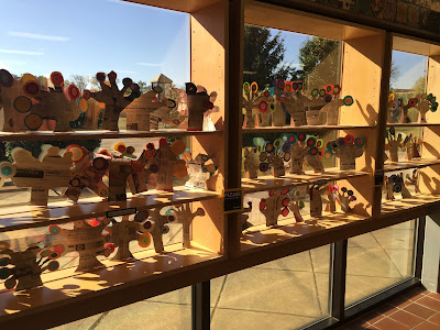
I like to set goals for myself for each school year. They are usually based around what I'm going to teach in a given year. This year, my goal is to write a sculpture lesson plan for each grade level. I have really nice display shelving that I fear goes unused for much of the year simply because of the fact that I like to save most of my ceramic work for the art show in the spring. 

This lesson is the first part of my goal coming to fruition. The basic idea came from a blogger I found through Pinterest. I adapted the artwork that her students created and re-worked the artist inspiration to match some other ideas that were rumbling around in my head. 
The artist I used to inspire the lesson is the multi-talented Austrian artist Friedensreich Hundertwasser. If you don't know this guy, look him up. He's a complete trip. I like his paintings, but his architecture is amazing. During class, we talked about his use of organic lines, bright colors, and his passion for environmentalism. We then created tree sculptures made almost entirely from recycled materials. 


Hundertwasser has many paintings featuring trees that look strikingly similar to lollipops  We took the idea of lollipop trees and made trees with lollipop leaves. The trees were made from poster board scraps, newspaper, scrap construction paper, a little Modge Podge, and a bit of glue. We thought it was pretty funny that we were making recycled art trees out of paper that originally came from trees. I think we completed some sort of environmental circle with this lesson. Either way, it was a super successful lesson and a great learning experience for my 2nd graders!

Click here to download my lesson plan!


Friday, November 13, 2015

5th Grade Personal Logos

Most of the lessons in 5th grade revolve around careers in the art field. When I was in elementary school, I don't think that I truly understood that all artists weren't just professional fine artists. After graduating from art school, I now know how many careers relate directly to visual art. I want my students understand that. 

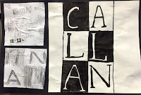
The first project for 5th grade this year is based on the career of a graphic designer. Students were asked to design a logo that represents themselves. We really dove into a lot of professional examples and dissected them to figure out what makes a good logo work. We spent a lot of time on thumbnail sketches. A lot of time. Most students 20+ thumbnail sketches. After a couple rounds of peer review, students created two second drafts, then eventually made a large version of the final logo. 

I really like this project because it allows students to demonstrate their thinking throughout the entire design process. The final work is mounted along with the thumbnail sketch and second draft that most closely resemble the final logo. The final work turns out very nice and it allows me to get to know my students a little better. 

Click here to download my lesson plan!

This student enjoys hunting. What a well done logo!