Instagram

Wednesday, April 24, 2013

4th and 5th Grade Bottle Cap Mural


 Why does it seem like it's been such a long time since I've posted a bottle cap project? It's because it has been a really long time since I've done one! I had wall space picked out in my school last year when I was approached by our  local Dublin branch of the Columbus Metropolitan Library to create a piece for them. I thought it sounded like a capital idea. The library had very specific ideas for the content of their mural, so I had students submit sketches. That is as far as it got. Between having a spring quarter student teacher and getting busy with my art show, it just never happened.

I finally got in gear this year. All in all, I decided I liked the idea of doing bottle cap murals every other year. It is such a huge, time consuming project that it just makes more sense not to do it every year. With the new format, I included both 4th and 5th grade students. 

I run this mural as a side project for early finishers at the beginning. After compiling several of the best sketches, I drew out the design on the boards that students had primed. Over the course of a couple of weeks, students paint the background with latex house paint. They then clean up paint edges with a super thick black marker once all of the painting is finished. At that point, the mural is ready for caps. I have each table of students help apply caps using a hot glue gun. When a board is finished, I screw in the caps with these screws. Luckily I had lots of help with the screws this year because my contact at the library recruited her staff to lend a hand.

Saturday, April 20, 2013

Spring Header Cleaning and Blog Design Tips

Every once in a while I get a hankerin' to change the design of the blog a bit. The header is the perfect place. So, without further ado, say hello to the new Thomas Elementary Art header. Hello! (That's the blog header responding. No, it's not weird for a blog header to be talking back.) Other than having an underlying art theme, I really don't design my headers to have too much relevance to my school or what is going on in my room. I'll create something simply because I think it's amusing. I don't think I'm completely satisfied with it yet, but it's close enough to post. 

My Thoughts on Classroom Blog Design:
I like to keep the basic design of the blog pretty clean and as easy to read as possible. I regularly see blogs that are poorly designed and difficult to read. Here are a few tips from me to keep your blog lookin' spiffy! Feel free to print them out and tape them to your favorite shirt. 
  •  Your student's artwork should be the star of the show.
  • A blog is meant to convey information to the viewer. It should be easy to read.
  • Try to avoid busy or overly chromatic backgrounds that distract from your content. 
  • Use value to your advantage. If you put red type on a blue background, your viewers may go cross-eyed. Scintillation should remain on black light posters. 
  • Use a legible typeface. Don't ever use Comic Sans. It won't ever be cute. 
  • Customize! I hate pulling work off the internet to use as a header. Show off your mad skills (skillz?) and create your own. I use one of the provided blogger templates as a general starting place for this blog, then I customize the wheels off of it using some easily available HTML. A custom header can give your blog an entirely different feel. I make my blog headers in Photoshop.
  • Make navigation easy.
  • Animated GIFs stopped being cool in 1997.
Here is what the old header looked like. That beady eye was starting to creep me out.


Tuesday, April 16, 2013

5th Grade Stop Motion Animation

At long last, the 5th grade is finished with their stop motion animation project! This project requires dedication because it certainly isn't short at all. In the past, I've split each class into job groups and had each class make one portion of a four part animation. This year I decided to change things up. 

I wanted to give my students more freedom in both the writing and animation process. I dedicated part of my budget this year to purchasing three more digital cameras and tripods. This allowed me to have four separate animation groups in each of my four 5th grade classes. Each group wrote a script, made characters and sets, filmed, and digitally edited their own animation. 

I really liked most of the results this year. I even make a cameo in one! The video you're seeing includes the work of all 16 groups. The major difference between previous animations and the work from this year is that the previous work was designed to have a storyline that made a little more sense to the audience. What makes sense to a 5th grader doesn't always make total sense to the rest of us! 

Check out the full lesson plan here!

Friday, April 12, 2013

2nd Grade Clay Dinosaurs


Spring is clay time at Thomas Elementary. I like to have several ceramic projects in the spring art show and I don't have anywhere to store hundreds of dinosaurs, bugs, castles, and coil pots. (I really do come off like a male teacher when I look at those topics!) 

I haven't done this project in a couple of years because of having student teachers so I was happy to get back to it. First grade always does a pinch pot based project, so this lesson adds new ceramic skills. The main artistic point of this project is the idea of scoring clay to attach two pieces together. At this point, you may be asking yourself, "Self, why isn't he having those nice children use slip?" To that I'd say, "Slip is totally unnecessary in an elementary classroom." I like to try to minimize potential reasons for unnecessary mess and time consumption. As long as the parts are scored correctly, all they need is a drop or two of water and a little smoothing around the edges to attach. 

The backgrounds are just a bonus on this project. I'm probably a little too careful with firing my clay pieces. I like to give them at least a week to dry out, so I always have a little mini lesson in between finishing the clay and painting or glazing. For this lesson, I had kids make a couple of background elements. I just choose a dozen or so from each class to attach to the "mountains" that I made out of craft paper and laminated for later use. 


Thursday, April 4, 2013

3rd Grade Machine Brains

 This is one of my favorite projects of the entire year for any grade level. It consists of massive integration of the science curriculum into the art room. I've always really enjoyed science, so maybe that's part of the reason why I enjoy this project so much. The point of it is to design a machine that has at least eight steps that does something that naturally occurs in a person's head. 

We always start this project by checking out a few of Rube Goldberg's hilarious machine cartoons. My students always get a big kick out of his work and it gets them thinking about the possibilities for their own projects. 

 Next, we talk about the six different simple machines and take a look at examples of each. Finally, we look at a few videos of Rube Goldberg style machines that people have actually built and put on YouTube. My favorite is a music video by OK GO. My students go nuts over this video.

 Finally, it's time to actually do some artwork. It takes a couple of weeks to brainstorm and get sketches finalized. It sounds like a lot of time, but it really does take that amount of time to do a couple drafts in order to ensure that the machines make sense. Final art is done on a 12"x18" white paper. I trace each student's silhouette during the sketching phase so it is ready to go when they begin their final. All of the machine parts are made with scrap construction paper. Huzzah for science and art!

Check out the full lesson plan here.

Click here for access to the presentation I use to begin this project.
(Download the presentation from Google Drive to use it. It will download as a Quicktime file that can be used on both Mac and PC. You will be able to navigate through using the arrow keys on the keyboard.) 

Tuesday, April 2, 2013

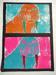
4th Grade Animal Printmaking (The best printmaking project I have ever done!)

Let me start out by saying this has been one of the most successful and visually stunning projects that I've ever done with my students. It is definitely the most exciting printmaking project that we've ever done at Thomas. I wrote the lesson and went into the project thinking that it would probably be pretty good. I told my students that I'm absolutely blown away by the results of their talent and hard work. This lesson is a keeper. 

My previous 4th grade printmaking lesson was decent, but not outstanding. It was too similar from an art-making perspective to the Wild Things I do with my 2nd graders. This year, I really wanted to push the medium a little more by printing with multiple colors. I ended up deciding to push it to three colors and add in a little vocab by also bringing in the use of complimentary colors. 

Check out the lesson plan here!
Close up of the piece above. Wow. 
Whew. That was a lot of examples, right? I just couldn't help myself this time. They were all so good that I had to show them off. If you're still reading, you're in luck. I'm going to tell you how I did this project and I'm going to use pictures! Let your inner kid rejoice.
Start with a drawing of whatever you want to print. I had my kids do animal portraits. I gave them each a piece of the foam they would be printing on, then had them trace around it to give them the size of the final artwork. I then collected the foam for use the following week.
Tape your drawing over the printing foam and use a dull pencil or other blunt tool to press
down on the lines of just the outline of the subject. Take the paper off and press down
again to make sure the marks are deep enough to make proper prints. I had my students make sure they ended up with three good prints of the background on the first day of printing.
Re-tape the original drawing the following class. Press down any remaining details. Cut out the subject along the line that was pressed down last time. Now print with this piece directly on top of the original prints. I had my students use at least one set of complimentary colors.
On the final day of printing, cut out a small detail that makes sense to print in a
third color. Then, you guessed it, print this piece right on top of the original prints.
This was my demo piece I did with the materials above.