
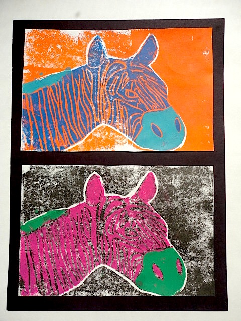
My previous 4th grade printmaking lesson was decent, but not outstanding. It was too similar from an art-making perspective to the Wild Things I do with my 2nd graders. This year, I really wanted to push the medium a little more by printing with multiple colors. I ended up deciding to push it to three colors and add in a little vocab by also bringing in the use of complimentary colors.
Check out the lesson plan here!



 |
| Close up of the piece above. Wow. |


 |
| Start with a drawing of whatever you want to print. I had my kids do animal portraits. I gave them each a piece of the foam they would be printing on, then had them trace around it to give them the size of the final artwork. I then collected the foam for use the following week. |
 |
| Tape your drawing over the printing foam and use a dull pencil or other blunt tool to press down on the lines of just the outline of the subject. Take the paper off and press down again to make sure the marks are deep enough to make proper prints. I had my students make sure they ended up with three good prints of the background on the first day of printing. |
 |
| Re-tape the original drawing the following class. Press down any remaining details. Cut out the subject along the line that was pressed down last time. Now print with this piece directly on top of the original prints. I had my students use at least one set of complimentary colors. |
 |
| On the final day of printing, cut out a small detail that makes sense to print in a third color. Then, you guessed it, print this piece right on top of the original prints. |
 |
| This was my demo piece I did with the materials above. |


